Colour is such a motivator and can really set a occasion. A room paint blue feels cool and tranquil and as for a room painted in neutral tones can feel organic and rustic. It’s not a coincidence that Coca Cola packaging is in Red giving the feeling of fun, energy and is eye catching.
Selecting the colour of your card front is equally as important to set the mood. Traditionally Christmas cards are created with primary tones such as Red and Green. Metallic colours are often used for a sense of glamour where as White for it’s clean and crisp appearance.
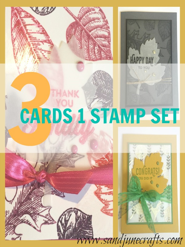
You will find the card samples I have made using Stampin’ Up!s Vintage Leaves stamp set great examples of this. I stayed with a similar layout to make the comparison much more obvious.